Is your gold stock truly golden? Part 1: The Gold Stocks
By this
"golden" metaphor we mean the stocks that truly are worth being
called the GOLD STOCKS. It's not that these companies are better managed than
other (however that might be the case) or that they have more appealing P/E
ratio than other stocks. The point is that some stocks offer you more exposure
to the price of the yellow or white metal, than others. In this way some gold
stocks might indeed be called more golden than other.
If you invest in the GDX EFT then you might be
specifically interested in the subject, as most of the stocks covered in the
below analysis are included in this fund. In fact only stock that we analyzed
that is not a part of GDX is FCX.
.
Exposure
OK, in order to find out how much exposure to
the price of gold a particular stock has to offer and to compare it with other
companies, we need to choose a way of measuring this exposure. One way to do it
is to dig into company's profile, balance sheet, profit and loss statement,
cash flow statement and other documents and try to establish how high fixed and
variable costs are involved, company's policy, environmental laws and so on and
so forth.
Sometimes, after you would go through all that
papers the situation would change dramatically and/or the market would not
agree with you and value the stock differently for a long time. This is one of
the reasons that we will not use these methods in this essay. Instead we will
adapt a different approach. Let's see what the market thinks about particular
stock. If that's true that all information are discounted in the price then
perhaps we can infer the information we need straight from the price itself. We
can do it by doing some statistical calculations on the prices the market gives
us. We decided that the best measure here would be the R–square coefficient.
From definition (source: Wikipedia): R-square
is the coefficient of determination. It is the proportion of variability in a
data set that is accounted for by a statistical model. In this case R-square
tells us how much of particular gold stock's price is explained by the price of
gold. In other words how much of the stock is exposed to gold or silver and how
much to other factors. Generally, you probably want to invest in a company,
whose price depends mainly on the price of gold, not on any other thing. You
want a company that uses its resources to produce a profit from its precious
metals operations, not from other activities. Of course it makes sense for some
companies to seek alternative profit sources - for example there are times,
when some of the America's biggest car producers would not be making a profit
if it weren't for their financial operations... BUT After all, you wanted a
GOLD stock, right? The closer R-square gets to 100%, the more exposure to
gold a particular company has.
Before we proceed with our analysis of the R–square coefficient, we have to digress a bit.
You have to be very careful when applying
statistical tools and measures to finance. Sometimes the assumptions used don’t
correspond to financial reality. Even if they do or the error you would have
made by using them is really insignificant, you can’t be sure that the model
gives you what you are looking for. It is common that the author of a
particular publication makes the calculations basing on some data, that is not
really relevant, or the reasoning behind choosing a particular model is not
explained to the reader. Not only is
this confusing to the reader as it is more difficult to understand a particular
topic if one does not know what author’s assumptions were, but it can also be
misleading. For example reader might not be aware (Why would he/she? Not
everyone needs to be on the cutting edge of statistics or mathematics) of the
fact that there were actually many models to choose from. Choosing similar (but
different) set of input data could lead to dramatic change in the results and
therefore greatly influence their interpretation.
This article will feature some statistical
measures and their basic transformations. We will try to explain our
methodology as clear as possible in order to avoid any misunderstandings.
Should you have any questions, you can reach us via the Contact Section on our
website at www.sunshineprofits.com
Before presenting results of our calculations we
would like to tell you a little more about the way we constructed our models. Having
a chart or graph in front of one’s eyes always helps in understanding a
particular topic, as you can directly see what the topic is all about. In the following
part of this essay we will give you a brief introduction to the way R–square
coefficient is generally used and provide you with our reasoning behind our
methodology.
First let us show you how tricky it can be to
focus just on pure numbers. We have already stated that R–square tells you
which stock is explained to the greater extent by the price of gold, so you
should not have any trouble playing a little game with these coefficients. Please
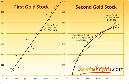
take a look at the charts below. They both represent the relations between two
theoretical gold stocks and the price of gold. We have calculated the trend
lines for linear models for both stocks (on the Second Gold Stock it’s the
thin, dotted line) and respective R – square values. Without looking at the
answer right now, try to answer the following question:
Which of these two precious metals stocks is better explained by the price of gold?
So? What is the correct answer?
If you’ve pointed the Second Gold Stock as the
one that has been better explained by the price of gold, then congratulations,
you were right. The R–square value is higher in case of stock A only, if we
look only at the linear relations. If we allow ourselves to calculate this
coefficient for different models it becomes clear that the amount of “noise” on
the chart with Second Gold Stock is smaller than in case of the first company.
It’s not linear but... Who said the relation between gold and gold stocks
should be linear?! It does not have to be linear. Company’s profit does not
relate so directly to the price of metal itself. It could not, as so many
factors are involved. Both variable and fixed costs differ from company do
company, marketing strategies give different results, management has different
pay schemes and so on. Those were only the differences in profits. Now take
into account different dilution of shares and you get the idea why not always
the assumption of linearity needs to be fulfilled.
Since R–square can be calculated for various
models, we will present you with our results of calculating these coefficients
for best models. Before choosing your favorite gold/silver stocks and putting
your money on the table please note that using R–squares obtained from
different models may be sometimes misleading. R–square as such does tell you
how well this particular model reflects used data. Higher R–square values may
not always mean exactly that a particular gold/silver stock is more influenced
by price of gold/silver (as it was in the case of presented theoretical gold
stocks). If stock A has higher R–square than stock B, it may also mean that
the model applied to stock A suits it better, than the model applied to stock B
suited stock B. Keeping that in mind you need to be careful when comparing
similar values of this coefficient. The table that we will present in this
essay was created using different models – for each stock we chose the best
trend line and calculated R–square for this particular model. R–squares’
comparability is therefore limited. We take the view that you can compare
stocks only if the difference between coefficients is not minor. For example we
would not differentiate between stocks that have R–squares of 71% and 73%,
but we certainly would if they equaled 30% and 80%.
Having said that let’s get to the merit of this
article – we’ll going to tell you which stocks are most influenced by price of gold – in other words those that give you the biggest bang for the buck.
Below you will find chart which shows the relation between the price of gold and one of the well known gold stocks – Agnico-Eagle Mines Limited (AEM). Please take a moment to study the chart before you continue reading.
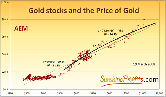
As you may see, the chart covers data for both gold
and AEM back to the beginning of this bull market, when gold traded below $300,
silver was well below $5 and neither of them was a very popular investment to
say the least. Basing on the price of gold and respective AEM share price, we
calculated and attached the trend lines which best represents the relation
between both variables. Not all of this data is used for each trend line, as
you may see on the chart, but we’ll get back to this later in this essay. Right
now we would like you to focus on the shape of the trend lines. Please note
that the dotted, thin line rises exactly at the same pace for every dollar move
on the price of gold. That is pretty obvious statement, but for the record –
that is a linear trend line. Trend lines don’t always have to be linear. For
example the shorter, thicker line is in fact a logarithmic trend line. This
type of trend line rises at higher pace at lower gold prices but then this pace
declines along with higher prices of gold. We’ve taken into account several types of
trend lines and found that these two are best to represent the data that goes
back to January 2002 for the thin line and January 2006 for the thick line. We’ve
chosen the first date as it represents the moment when both gold and the HUI
index broke out of their long-term downtrends. One may argue whether time
between 2000 and 2002 was still bear market or was it already bull market, but most
people (of course except for the gold perma-bears, who will still deny the
bull’s existence) agree that in 2002 we either began or already were in the
first stage of the bull market in precious metals. So, the share price of AEM for
the entire bull market can be best described using the linear model. We can say
that, because we’ve checked R–square values on the same data for different
models. We’ve chosen from linear, logarithmic, power and exponential trend
lines. All other models gave R–square
values lower than the linear one. R–square of 91.3% means that in this model price of gold accounted for 91.3% of the AEM
prices’ move. This is a very good result in the long term – if you’re
looking for stocks with direct exposure to gold, AEM is sure worthy to be put
into your portfolio.
In the search for coefficient that might better
match current time, we separately calculated trend lines and R–square for shorter
term – for the second stage of this bull market.
In the second stage new groups of investors
enter the market. In this case that would be financial institutions recognizing
the presence of the bull, as well as foreign investors, who see precious metals
appreciate in their local currencies. Since we have different investors, we
might infer that the average way of perceiving risk and leverage associated
with mining stocks will also change accordingly. In our view, we are still in
the early part of this phase, so it makes sense to develop unique tools and
make specific predictions with this stage in mind. This is why our research
towards estimating particular gold stocks’ exposure and leverage to precious
metals will focus on this time frame.
For this, more detailed analysis we will use
the data that goes back to the beginning of 2006. That was the time, when gold
broke out of its trading range in Euro and stayed above previous resistance
long enough to attract new capital. One might argue whether this is precise
time when the second stage of this bull market began (some prefer to think of
the breakout date as the exact beginning) or not, but choosing this date has
also additional advantage to our analysis.
Beginning of 2006 is also the moment when
prices of precious metals reached important levels: $550 for gold and $10 for
silver. Once these milestone were achieved, the price accelerated and peaked a
few months later. Since then we have endured a long consolidation phase, during
which these important milestones have been tested and verified as new
super-strong resistance levels. That gives us reasoning for making the
assumption that we will not see these levels breached to the downside in the
near future - by that we mean at least the second phase of this bull market. Of
course everything is possible in these volatile markets, but some events such
as this one are very unlikely.
The bold line on the above chart of AEM
represents the trend line, which is based on the data exclusively from the second stage of the bull market. This time the trend line is logarithmic and the R–square
value equals 90.7%. It seems that the company might have lost some of its
exposure to the price of gold, but it’s a tough call, as the difference between
both R–square values is really minor. Nonetheless
the true implications of these values
will emerge as we compare them with results for other gold stocks.
We already know what information we might infer
from the value of R–square coefficient, now we have to be sure that we know
what this coefficient does not tell us.
R-square does NOT tell you how much leverage
to gold does a particular gold stock have. It informs you exactly what percent
of past observations (stock prices) have been explained by the price of gold in
particular model and that's it.
Leverage
If you want to know the real leverage you need
to find out exactly how much percentage-wise (theoretically) should a
particular gold stock move if the price of the underlying asset (gold) had
risen by 1%. Choosing simply the coefficient that decides of the slope of the
trend line (0.086 in the case of AEM) as the measure of the leverage for the
whole bull market can be misleading. That means that for every 100 dollar rise
in the price of gold, price of AEM will increase on average by $8.6.
Unfortunately that is not comparable to coefficients of other stocks, as the
nominal prices of stocks are different.
For example if you have stock A that trades at
$100 with slope coefficient of 0.5 and stock B that trades at $1 with slope
coefficient of 0.1, which one of them has higher leverage to the price of gold?
Remember the slope coefficient tells you how much will the stock gain in dollar
terms if the underlying metal rises by one dollar. The answer is stock B. That
is the case, since when gold rises 1$ the price of A rises by 50 cents which is
0.5%, while the stock B would rise 10 cents which is 10% of the stock value. If
you want to be leveraged, which stock would you prefer - the one that moves by
half percent with every dollar move on the price of gold or the one which moves
twenty times more - by 10% percent?
Of course the answer is: Stock B.
Therefore we have transformed the slope
coefficient of AEM’s second stage (since 2006) trend line so that it can be
comparable to coefficients from other stocks. The result is about 1.20% for gold in the $800 - $1000 range. Please note the word “about” – we cannot
say accurately, because is the selected (linear) trend line, the leverage is constant
in dollar terms, but if we take into account the share price and the price of gold,
we get beta, which takes diverse values for different gold prices. In fact,
only the leverage calculated for power trend lines is constant in percentage
terms. In the case of AEM, the beta would be 1.40% with gold at $800 and 1.07%
with gold at $1000. Calculating
leverage for a specific gold price is not much of a disadvantage, since non-linear
models have different slope coefficients for different gold prices, so the
distinction between different prices and following different betas would have
to be made anyway.
Astute reader might ask about the slope coefficient, as for example logarithmic function does not have one defined slope. This is why we take the slope at exact price of gold. For one, precise point we might calculate the slope coefficient for the tangent of the trend line. Please take look at the following chart – we used the same theoretical data as in earlier example:
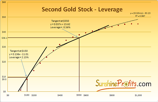
Please note how the leverage changes along with
the slope of the tangent, which of course changes along with the price of
underlying metal (gold in this case). Although the price of the Second Stock is
very well explained by the price of gold (R – square = 98,7% ), the leverage
that the company has to offer is very discouraging at higher gold prices. With
gold at $550 the price of this stock will rise on average by about half
percent, when gold moves one percent. One could even say in a sarcastic tone,
that it is the gold that has leverage to this stock, as it outperforms it
without the inherent risk that the stocks carry.
What are the implications of this all this for gold stock investors and speculators? First consequence is quite obvious –
you need to know the time frame for which you want to invest or speculate. In
the above example if the price of gold were at $100 and you would want to bet
your money on the move to the $200, then this stock would be great. On the
other hand, if current gold price were $800 and your strategy was to hold this
stock until gold reaches $1000 then you should probably consider other options.
Our research shows that when it comes to gold
and gold stocks during the second phase of the bull market, they are best
characterized by the linear, power and logarithmic trend lines. Like we stated
earlier, power trend lines mean that the stock’s leverage to metal (gold) does not
change percentage-wise. For other types of trend lines the leverage (beta)
changes along with gold prices.
Here’s how you can deal with these conditions
for different strategies:
For short term trades (for example for 50 dollar
move on the price of gold that you expect to take place within next couple of
weeks) you will not make a big mistake by choosing stocks basing on their current
betas.
For medium term transactions you may also stick
to current betas, as long as you make sure that the leverage will not change
dramatically during your the time you want to hold your position. The table in
the later part of this essay might prove helpful in this approach.
If you plan to hold your stocks for some time
(and take advantage of large upleg in gold) good idea might be to take into
account the leverage for the average price of the metal (for AEM it is
naturally gold). So, if you expect the price to go from $800 to $1200 you might
want to check first the leverage for both $800 and $1200 and then the leverage
for the average price – $1000 in this case. Small difference between the
beginning and end values tell you that the leverage is pretty stable in this price
range and that you really don’t need to make any adjustments – results are
informative enough.
If there is a huge difference between leverages
for a particular stock, you should calculate them manually. That means putting
the initial and final price of gold for your transaction into the equation of
appropriate trend line. Then you have to see how much percentage-wise your
stock would rise and compare it with other stocks for the same rise in the
price of gold. The one which rises most percentage-wise is obviously most
leveraged. You can do these calculations roughly reading the values from the
charts (not precise), you may find in the full version (will be posted soon) of this article or you
can use the Tools section (which we recommend) on our website to get gold stock
prices for any gold price.
Without having proper
(sometimes non-linear) trend lines and without realizing that the leverage
usually changes along with the price, your chance for choosing optimal stocks
for your portfolio is limited.
OK, we know what R–square means and what is does not mean. We know how we might estimate gold stocks’ leverage for different durations of transactions. Like we said earlier in this essay, we will now provide you with R–square values and leverages at several prices of gold. Please see the tables below:
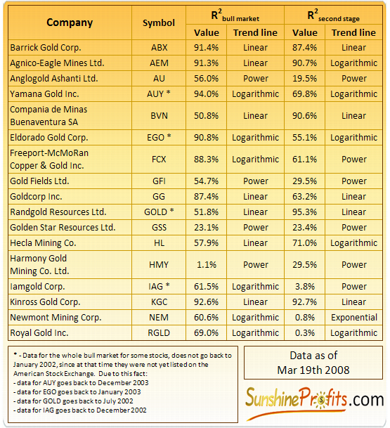
As you see, the vast majority of gold stocks
show direct relation to the price of gold in the long term. No wonder – mining
gold is what they do. One company that has surprisingly low R–square value is
HMY. This stock is priced at the same levels now, as it was the case with gold
3 times cheaper. Not really staggering performance up to date. If we looked at
the separate results for the second stage of the bull market would see that some
stocks actually gained exposure to gold (in market’s eyes), for example GOLD
and BVN. Perhaps these companies were undervalued by investors is the first
stage of the bull market, but demand from financial institutions changed this
situation. Some stocks lost much of their exposure to gold. For example RGLD, NEM
and IAG don’t seem to act like gold mining companies at all. Market’s
perception toward these companies has changed dramatically as their prices
don’t reflect movement in the price of the yellow metal. There are times, when
these stocks move in the same direction as the price of gold, but the general
tendencies remain in place. In the case of HMY the R–square increased in the
second stage, but pure numbers don’t say that this stock tends to decline (!)
along with the price of gold and that is the shape of the relation that seems
stronger in the second stage.
Detailed information about gold stocks’ leverage should make things clear, as to which stocks have a tendency to outperform gold and which don’t. Please see the table below:
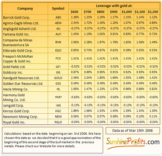
The leverage coefficients tell you how much
percentage-wise you will gain when the underlying metal rises by 1% and the R–square tells you what part of this rise may be attributed to the rise in the
price of the metal. All featured leverage values (betas) are standardized for
1% move in the price of given precious metal.
As you may see on the above chart, the leverage
of about half of the stocks is above 1% for gold price of $900, meaning that
you get some extra profits by using these stocks as a proxy for gold instead
investing in the metal itself. Some stocks have leverage below 1% meaning that these
stocks underperform gold on a percentage basis. There are also stocks with
negative leverage. That means that of average they have been declining when
gold was rising. Not very attractive perspective for people seeking exposure
and leverage to gold. Please note that we have included Hecla Mining Company in
our list of gold stocks, though it is usually considered a silver stock – in
fact we will include this company in our research of silver stocks in second
part of this essay. We did put it here, because this company has similar exposure to both
metals – according to the financial statements of the company. By this we mean
that the company gets similar levels of revenue from sales of gold and silver. Also
please note that the sum of R–square values for Hecla for silver and gold may (and it currently does, as you will see in our next essay) exceed
100%. The reason for this situation is that gold and silver are correlated. You
can therefore still use both R–square values to compare Hecla to other stocks
from gold or silver sector. What you should not do is to compare these two
values between themselves with regard to the underlying metal to see which metal has more influence on the price of this stock, as it is not
what these coefficients were originally supposed to measure.
Before you choose your favorite gold stocks
and make a purchase or add to your positions we strongly encourage you to make
additional analysis covering fundamental and technical aspects of these
companies. Also please remember that it’s not a bad idea to diversify your
holdings, meaning that it’s prudent to hold more than just one gold stock.
Although we strongly believe that the
statistical measures used in this essay are very helpful tool in choosing stocks
for one’s portfolio and we use it ourselves, we must inform you about possible
risks involved in using statistics for making your trading decisions. Not all
assumption made in statistical models are necessarily fulfilled in the capital
markets.
If we used statistical tools directly to
trading we would have to be sure that these unrealistic assumptions will not
make us lose our money. They are of lesser meaning if we use this data to
compare stocks between themselves. Even if each calculated coefficient is
biased as a result of assuming normal distribution of returns, it does not pose
a serious threat as long as you only use the results for comparison. If all
results were biased from the same reason, most likely the relations between
them would not be affected.
This is the shorter version of the essay. The full version (containing charts with trend lines for all
popular gold stocks including: KGC, NEM, GG, ABX and more) will be posted soon on our
website at www.sunshineprofits.com
- just browse the Research section in a few days.
Want to know exactly how much will a particular stock have leverage at given silver or gold price? We designed a model that will provide you with that information. Visit our Tools section on www.sunshineprofits.com for details.

![[Most Recent Charts from www.kitco.com]](http://www.kitconet.com/charts/metals/gold/t24_au_en_usoz_4.gif)
![[Most Recent Copper from www.kitco.com]](/files/idx24_copper.gif)
![[Most Recent XAU from www.kitco.com]](/files/idx24_xau_en_2.gif)
![[Most Recent HUI from www.kitco.com]](/files/idx24_hui_en_2.gif)
